Color psychology — the study of how color can influence our emotions and behaviors — has been around for a long time. From the ancient Egyptians using colors to symbolize specific ideas to modern interior designers using color to create certain moods in people’s homes and offices, color can make or break anyone’s day.
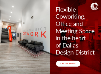
There’s no better place to get in a color mood than the shops and showrooms at the Dallas Design District. Here are a few of our favorite colors to use in designs and the effects they have on the people who inhabit them.
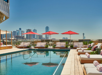
Red
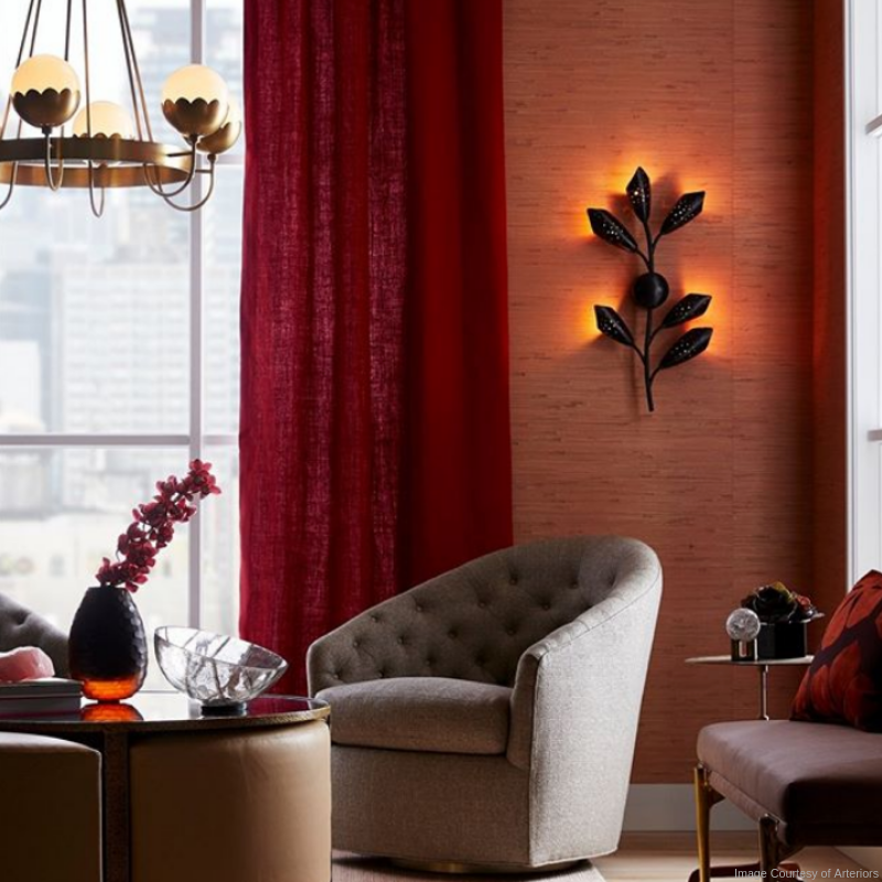
Red is invigorating. It raises the heart rate and gets the blood pumping, making it a great color to use in a room meant for socializing rather than sleeping or relaxing. Consider using red in a dining room or living room to stimulate conversation. Find the perfect red to make your heart go pitter-patter at Arteriors.
Orange
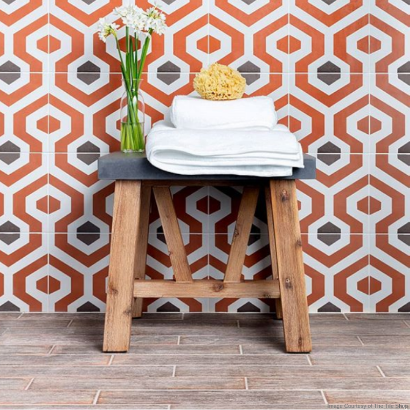
Orange is an enthusiastic color! It’s energetic. It’s exciting. Because of this high-energy feel, orange is quite fitting for a child’s playroom or a fitness room. It also increases the appetite, so an orange backsplash or tile in the kitchen is a great spot for this color. When you’re ready for some excitement, make sure to stop by The Tile Shop.
Yellow
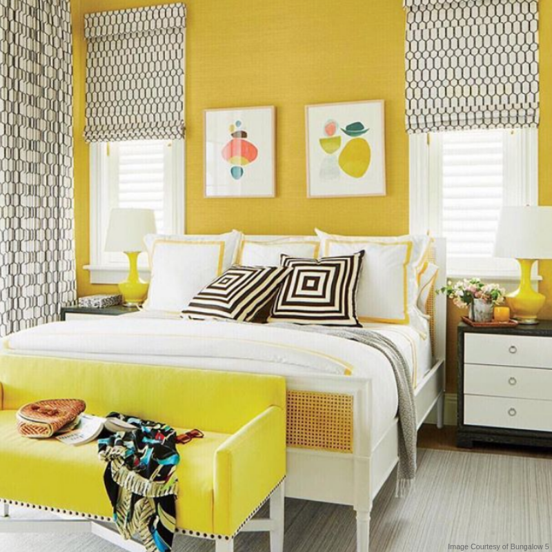
Good morning, sunshine! Yellow is an uplifting hue that evokes feelings of happiness. Where do you need the most help getting into a cheery mindset for the day? Perhaps incorporating a buttery yellow shade in the bedroom will help you hit that snooze button a little less often. You could also add it to the bathroom or kitchen to make a dreary day seem brighter. Turn that frown upside down with a trip to Bungalow 5 for some sunny inspiration.
Green
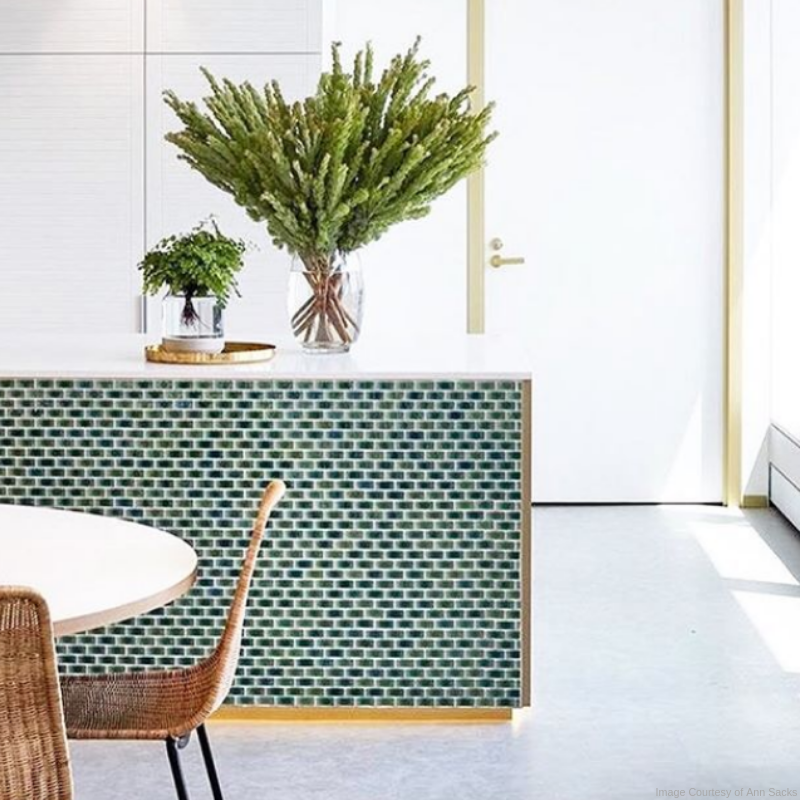
Tranquility. Nature. Serenity. These words are all associated with the color green, a calm, soothing shade. It’s perfect for creating a relaxing, spa-like environment in a bathroom. There’s also a freshness associated with the color green. Pops of green are perfect in a kitchen, where feelings of cleanliness and freshness are welcome. When you're ready to get your home looking “so fresh and so clean,” head on over to Ann Sacks to check out their selection of green tile.
Blue
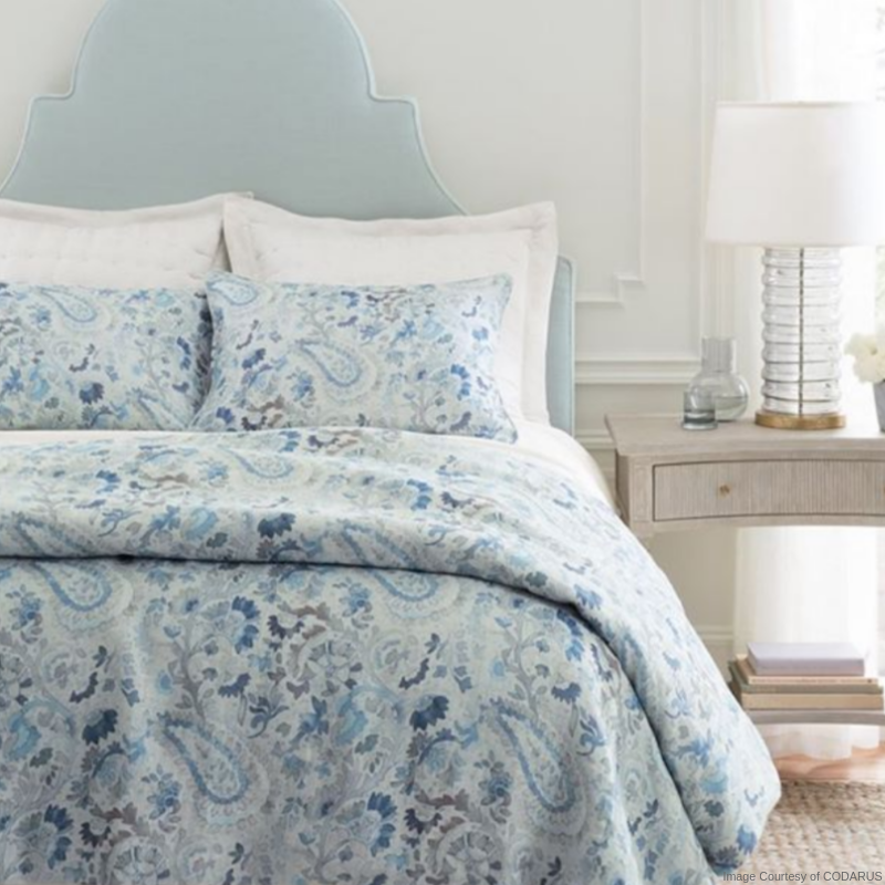
According to a 2006 study called Colour Assignment, blue is a popular favorite color for people of every age. This could be because it reduces blood pressure, creates a relaxed feeling and communicates a message of trust and strength. Because of this universal popularity, blue is perfect for almost every room. Bring on the cool blue with the collaborative team at Codarus.
Purple
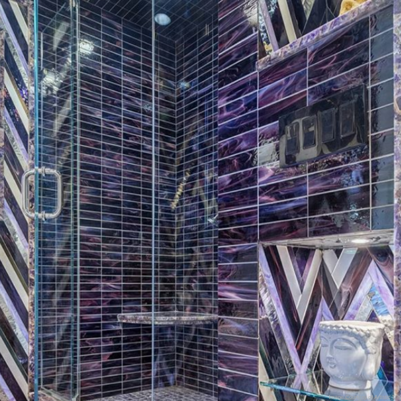
Purple is the color of royalty, so think luxury and nobility when you're incorporating purple shades in your decor. Add some dramatic flair to your home office or foyer with purple. Or get in a queenly mood as you get ready for the day with a purple-tiled bathroom. It’s also a great color to spark creativity. And what better place to get artsy and creative than Artistic Tile?
Pink
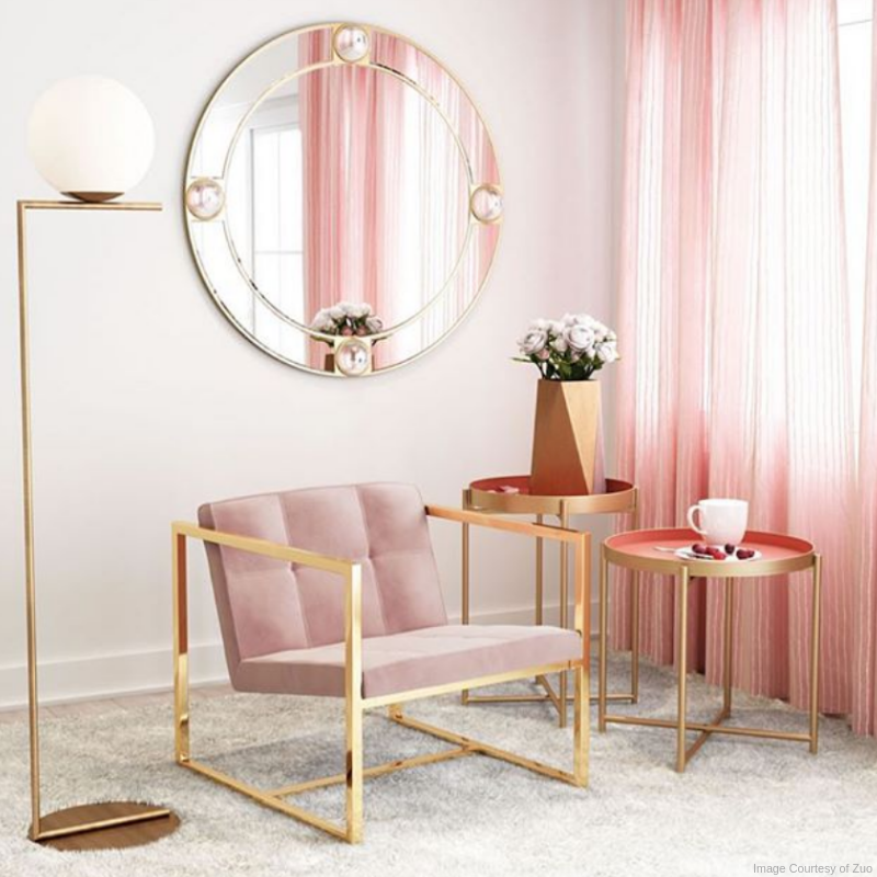
Pink is flirty, feminine and fun. It also pairs well with bolder, more masculine tones to bring some balance to your color scheme. But be careful — too much pink and you’ll end up with a sickly sweet, saccharine feel. If you’re ready to think pink, the folks at Zuo can help you find the perfect color balance to create the mood you’re looking for.
Whether you’re looking to revamp your entire home or you just want a little refresh, be sure to stop by the Dallas Design District. The expert design teams at all of our shops and showrooms know how to get you in the right mood with color!